Wages: Up, Down, or Sideways?
We’re coming up to a Federal Election, and one where “The Economy” will likely be a central battlefield. As such, we’re going to hear many claims and counter-claims that support the view that Stephen Harper is either the Greatest or Worst Prime Minister ever.
One point of contention is wages. Part of the problem are the units of measurement and analysis – hourly, weekly, or annual earnings, total vs. market income, median vs. average. So this post is a bit of a stream of conciousness graphing of the ways that we measure income, and what that means.
Weekly Wages
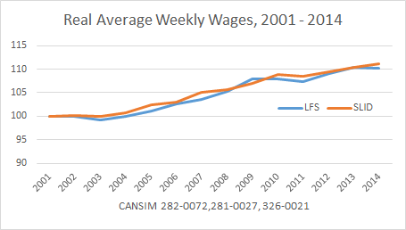
We often see graphs of total average wages, rather than median wages or other distributional analysis.
By both the Labour Force Survey (self-reported) and the Survey of Employment and Hours (payroll data), average wages have risen consistently since 2001 (as far back as this iteration of SEPH goes).
When we look at all wages, we miss some important dynamics – women’s labour force participation and education rates have dramatically changed over the past 30 years. So that’s going to have an impact on wages. This isn’t a new observation, but it’s often overlooked. SEPH tables don’t disaggregate based on sex, though, so this analysis is often missing. (At least sex isn’t available from the free tables on CANSIM).
Annual Earnings
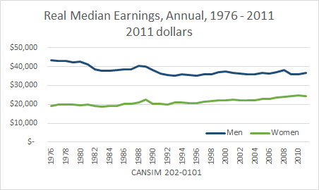
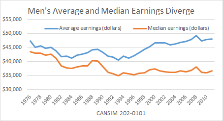
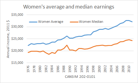
Annual median earnings only goes up to 2011, because SLID has been replaced (sigh). Still, what it shows is falling annual earnings for men in the middle of the income distribution, and only modest increases for women.
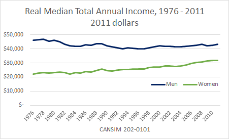
Have taxes and transfers helped? For sure. We still see pretty stagnant income for men in the middle of the distribution, but a more significant increase for women.
Note that total income in SLID includes EI, Worker’s Comp., Social Assistance, inheritance, returns on investments, pensions, as well as gov’t transfers such as GIS or the Canada Child Tax Benefit.
Full Year Full Time Workers
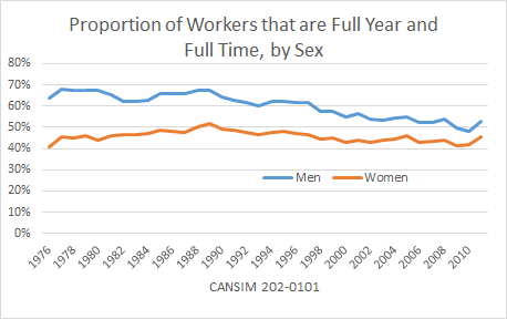
One other major difference between weekly earnings and annual earnings is whether or not you collect that money every week for the whole year. SLID gives us a picture of what proportion of workers were employed full-time for the whole year.
Since the 1990’s there has been a decline in the proportion of workers who work full-time for the whole year, again, more pronounced for men.
Median vs. Average
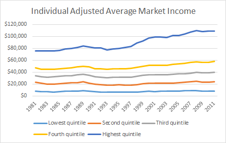
The second issue is that averages obscure growing inequality. Following the recession of the 1990’s, there was a marked divergence in men’s average and median annual earnings.
Women’s average and median annual earnings have diverged as well, but here the median is experiencing growth, just at a slower pace than those at the top.
The final word?
Men’s wages have definitely stagnated, and household income boosts from women earning more and working more may be near an end. Also: inequality matters.
(Note on how Statistics Canada arrives at this measure: In order to take into account the economies of scale present in larger households, the household after-tax income is transformed to express the household after-tax income per adult equivalent. All the persons of the population are ranked from lowest to highest by the value of their adjusted household after-tax income. Then, the ranked population is divided into five groups of equal numbers of units, called quintiles.)
Note: All graphs are adjusted for inflation.

As you point out – many ways to measure wages. One of the most sensitive to time is a monthly estimate of the year over year average weekly wage changes- quite the mouthful I know- but it actually does an amazing job of picking up the short term trend and is senstive- so what I do is put a smoothing algorithm on it.